Customisation of a navigation bar is one of the first tasks a junior iOS-developer takes up. Roughly every app (and even most of the test samples and tutorials) has a navigation stack and nobody wants to stick to the default system style of a bar.
Here is the first part of the series Navigation Bar Customisation. We’ll try to gather and systemise the knowledge on the matter, including the old ways to tackle it as well as the new iOS 13 approach. In this post we’ll recall the basics: the properties responsible for each part of the Navigation Bar and the ways we change their values according to our mock-ups.
(Here is the second part of the series where we talk about some architectural problems regarding the NavigationBar, UIAppearance and the new UINavigationBarAppearance)
The parts of a navigation bar.
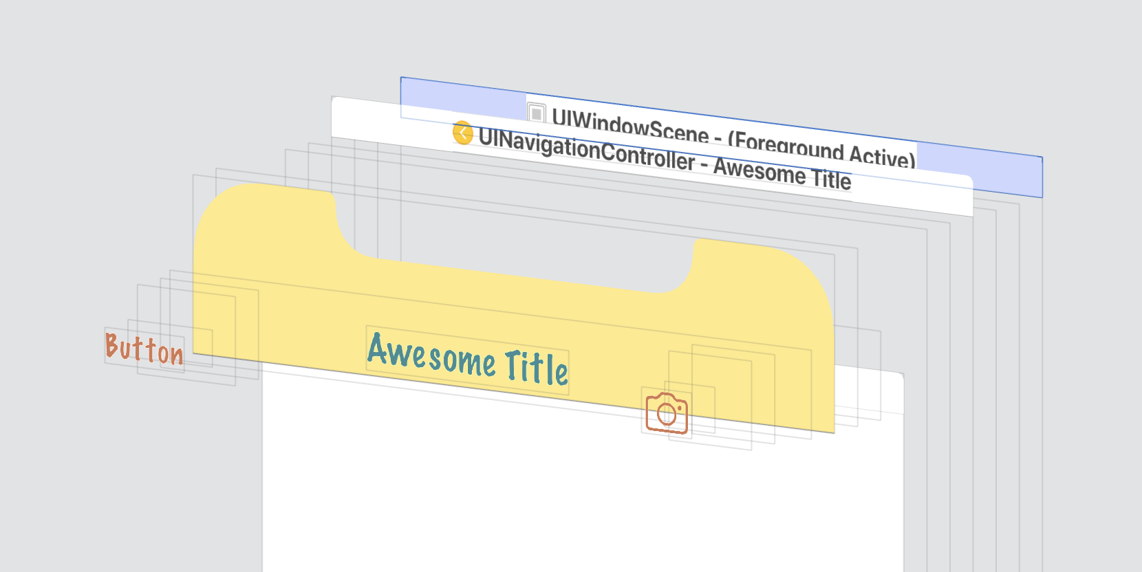
We have our navigation bar witch by default looks like this:

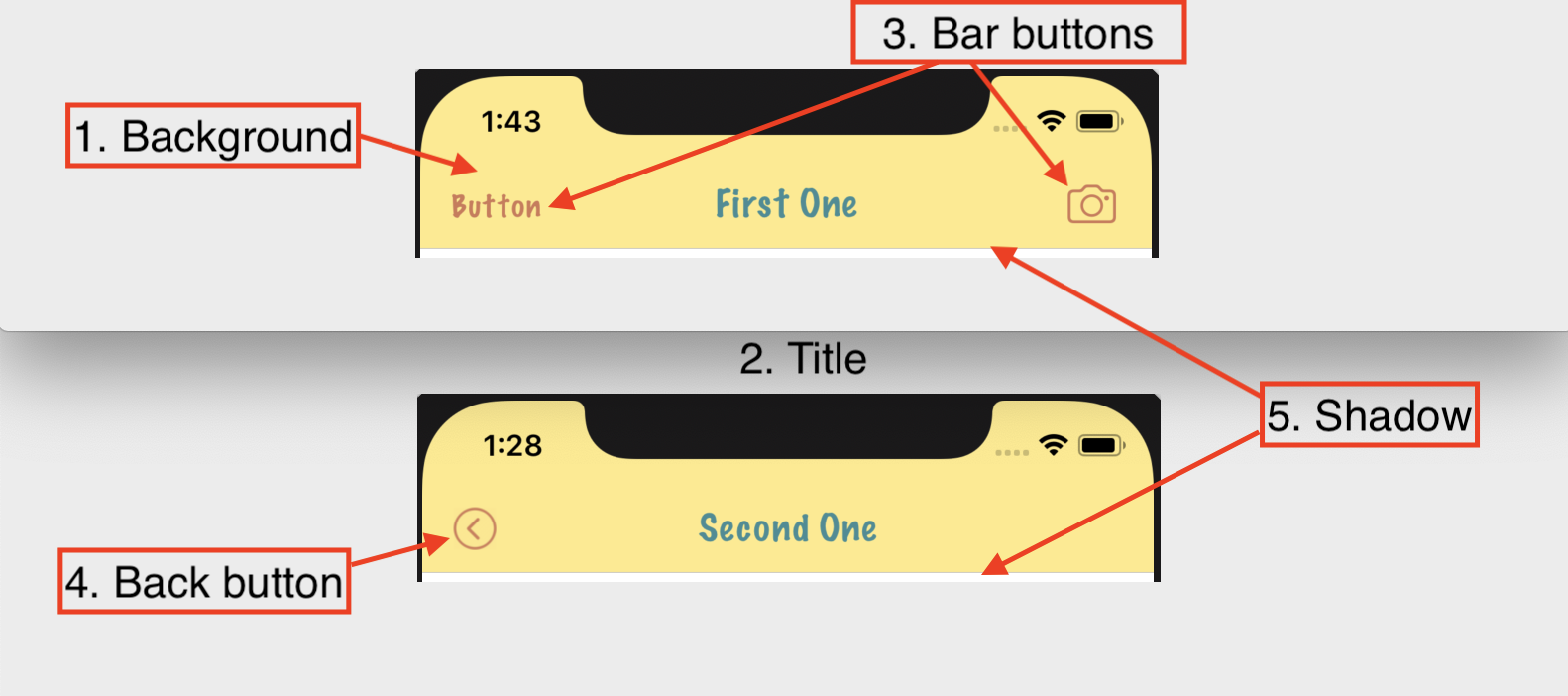
and we (or our UX/UI guys) want to see something like this:

Let’s take a look at UI-elements we see on screen:

- Background
- Title
- Bar buttons
- Back button
- Shadow/separator
1. Background
Changing the background colour is a trivial task:
navigationController.navigationBar.barTintColor = UIColor.yellow
navigationController.navigationBar.isTranslucent = false
If you don’t want the bar to be translucent just disable the corresponding property.
The main thing here is to pick the right property. Not backgroundColor like with all the other UIView-subclasses what would be more logical, not tintColor but exactly barTintColor.
2. Title
The first and the most primitive way to change title appearance (together with the status bar) is changing the bar style:
navigationController.navigationBar.barStyle = .black
The .default value of this property implies that the bar has light background, so the content (the title and the status bar) are black. Changing the style to .black turns the title and the status bar into white colour.
To properly style the navigation bar title (more than just switching from black to white colour) you have to set its text attributes:
navigationController.navigationBar.titleTextAttributes = [
    .foregroundColor: UIColor.black,
    .font: UIFont(name: "MarkerFelt-Thin", size: 20)!
]
Using text attributes you can customise not only colour or font, but much more including baseline offset, spelling, shadow or extended accessibility settings (the whole set of possible options can be found in the documentation
When we need more (for example, set an image as a title, make a two-lined title with a subtitle or do even crazier things) we can set a custom view instead of a default label to be our title:
3. Bar buttons
There are several ways to instantiate a bat button item.
Text button
navigationItem.rightBarButtonItem = UIBarButtonItem(
    title: "Button",
    style: .plain,
    target: self,
    action: #selector(buttonTappedAction)
)
Depending on the style the font will be regular or bold.
To change a color of your buttons (doesn’t matter whether they are text buttons or icon buttons) you should use navigationBar’s tintColor:
navigationController.navigationBar.tintColor = UIColor.red
But if we need more we resort to object’s text attributes like we did with title:
let regularBarButtonTextAttributes: [NSAttributedString.Key: Any] = [
    .foregroundColor: UIColor.warm,
    .font: UIFont(name: "MarkerFelt-Thin", size: 16)!
]
let leftButton = self.navigationItem.leftBarButtonItem
leftButton.setTitleTextAttributes(regularBarButtonTextAttributes, for: .normal)
leftButton.setTitleTextAttributes(regularBarButtonTextAttributes, for: .highlighted)
Remind you that bar buttons are properties of view controller’s navigation item and not navigation bar (it’s an important matter which will be discussed later). Also don’t forget to apply some attributes to both normal and highlighted states.
Button with default system design
navigationItem.rightBarButtonItem = UIBarButtonItem(
    barButtonSystemItem: .camera,
    target: nil,
    action: nil
)
This can be very useful in several ways. First of all using this presets you don’t need to worry about the best design for some frequent actions like “cancel”, “save” or “edit”. If you use this system enum you can be sure that your action will be understandable and native for the user because you let the platform (iOS) to take care of that. Secondly for text buttons like “done”, “save”, “cancel” you get localisation for free. And last but not least this items with the default system design will evolve together with the system. When after the next iOS release the system icon set is updated your buttons will get this update automatically.
Here is the list of possible options - UIKit documentation
Icon button
If you want your custom image to be on a button you can do it this way:
navigationItem.rightBarButtonItem = UIBarButtonItem(
    image: UIImage(named: "yourImage"),
    style: .plain,
    target: self,
    action: #selector(buttonTappedAction)
)
Be aware that this way the bar tint color will be applied to your image. Usually that’s exactly what you want from your bar buttons.
Button with a custom view
If you need even more customisation you can put any view into a bar button:
let button = UIButton()
button.setImage(UIImage(named: "rainbow-circle"), for: .normal)
navigationItem.rightBarButtonItem = UIBarButtonItem(customView: button)
For instance if you use a UIButton-instance the image will not be influenced by a bar’s tint color. This may also help you if you need more fine grained control over the different states of the buttons (.normal, .highlighted)
4. Back button
Back button generally is a bar button but it has several specific features:
- By default this button has both the image and the title.
- It has a special property in navigation item.
- It connects to a back swipe gesture recogniser of a navigation controller.
It’s also important to mention that the back button of current view controller is something you see when you push the next view controller into a stack.

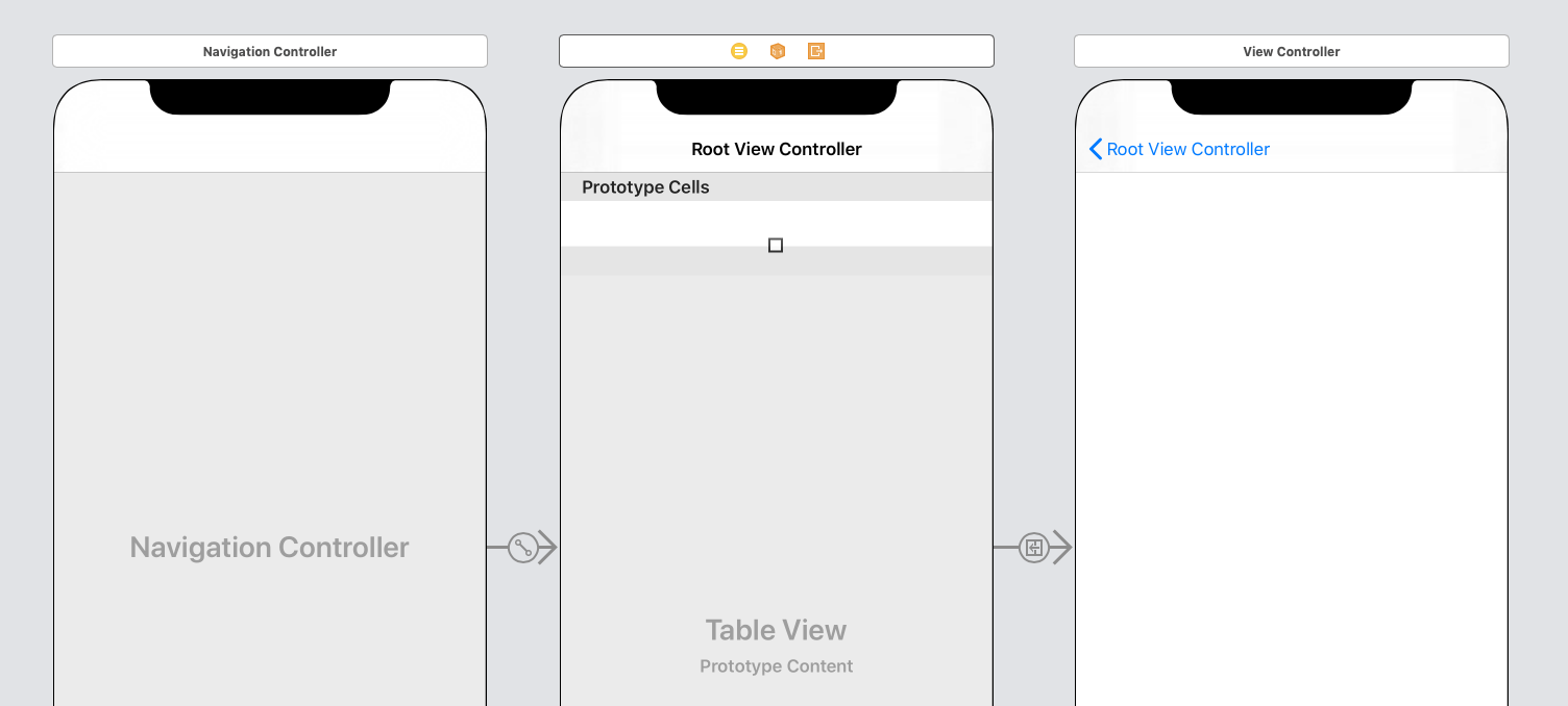
Here we have a navigation controller and 2 view controllers in its stack: Root View Controller and View Controller (I’ll call them RootVC and VC to make it shorter). The idea is that RootVC’s back button will be visible when VC will be pushed on screen. In a VC’s screen in the navigation bar there are VC’s title, VC’s right button items (if present) and RootVC’s back button.
That is quite confusing when you first see it but it has its logic.
By default the system puts a title of a view controller (meaning view controller’s property title) to its back button item. In our example it is “Root View Controller” for the first view controller in stack (RootVC). But you can see such a long string in a back button item only when you don’t have any title in our second screen (VC). Otherwise these two elements - the title of VC and a back button title of RootVC - don’t fit into the screen. In this scenario the system prioritises the actual screen title first (makes sense, right?) and replaces the back button title to “Back”. So don’t wonder why sometimes you see the actual screen name on a back button and sometimes it’s just “Back”.
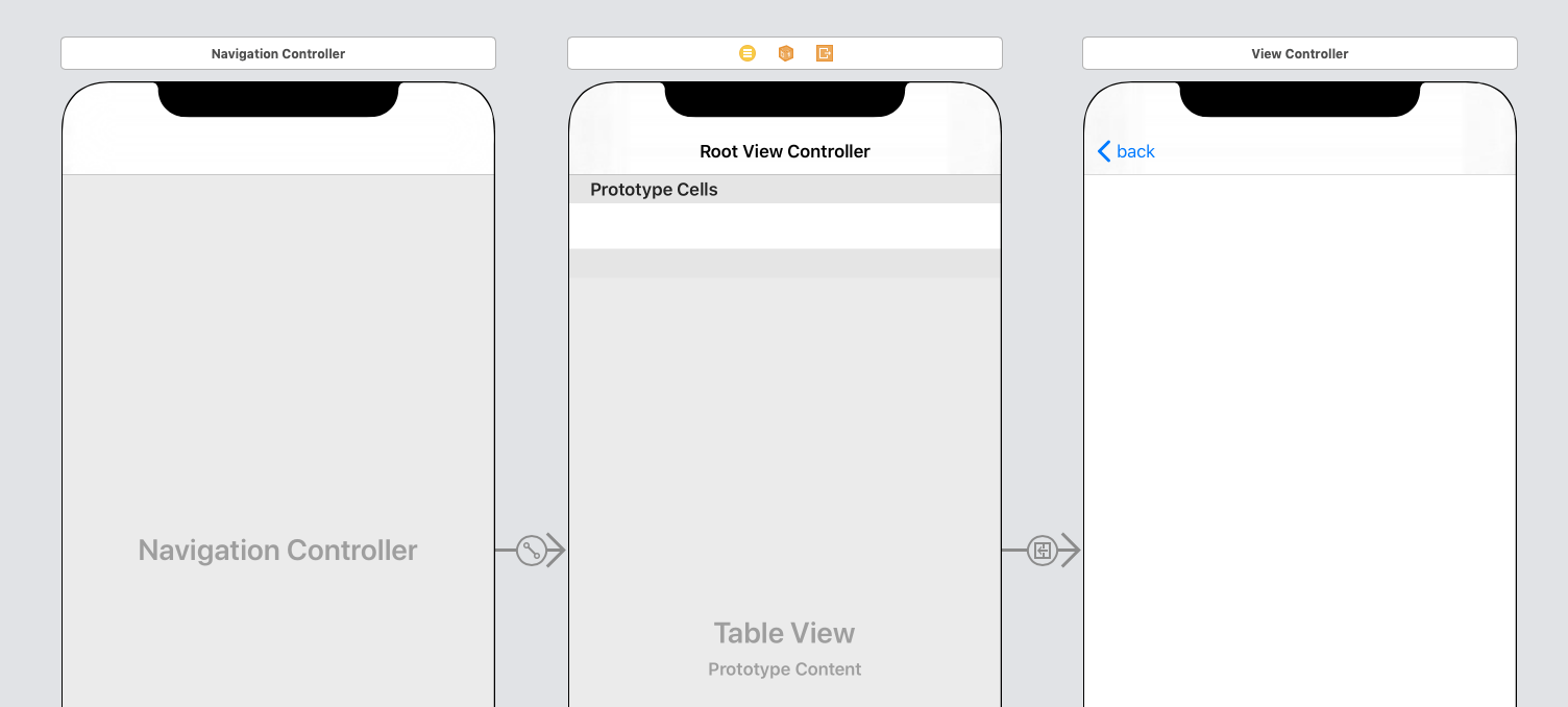
Let’s say we want to change the back button title from verbose “Root View Controller” (or “Back”) to just “back” without any capitalisation. We can do it as follows:
class ViewController: UIViewController {

    override func viewDidLoad() {
        super.viewDidLoad()
        // ...
        navigationItem.backBarButtonItem = UIBarButtonItem(
            title: "back",
            style: .plain,
            target: nil,
            action: nil
        )
    }

    // ...
}
Quite easy. Build, run, result:

If we want to remove the title at all we can just put an empty string:
navigationItem.backBarButtonItem = UIBarButtonItem(title: "back", style: .plain, target: nil, action: nil)
Let’s keep on changing it and add some custom action to the button:
navigationItem.backBarButtonItem = UIBarButtonItem(
    title: "",
    style: .plain,
    target: self,
    action: #selector(popToPrevious)
)
Inside popToPrevious() we do our stuff and after that pop the VC (after all that’s what should happen when you press back button):
@objc private func popToPrevious() {
    // our custom stuff
    navigationController?.popViewController(animated: true)
}
Everything works. Great! But what if we decide to use a custom icon for the back button (just an icon, no text).
navigationItem.backBarButtonItem = UIBarButtonItem(
    image: UIImage(named: "back"),
    style: .plain,
    target: self,
    action: #selector(popToPrevious)
)
That doesn’t look nice because the system adds a default image to our custom one. So we can use leftBarButtonItem-property instead and completely replace our back button:
navigationItem.leftBarButtonItem = UIBarButtonItem(
    image: UIImage(named: "back"),
    style: .plain,
    target: self,
    action: #selector(popToPrevious)
)
Everything is OK with that except we lost the back swipe gesture. But to bring it back we just need to redefine the gesture recogniser’s delegate (we don’t even need to implement any delegate’s methods):
navigationController?.interactivePopGestureRecognizer?.delegate = self
Let’s apply it with some custom title and background color:

Done: we have our custom icon, we can process the event of pressing the button, back swipe also works as expected.
5. Shadow
The shadow, or the separator between the navigation bar and the view is quite an invisible UI element. But it still can be an important part of our design.
UINavigationBar class has a property shadowImage. If you check the documentation you will see such a straightforward description:
The default value is nil, which corresponds to the default shadow image. When non-nil, this property represents a custom shadow image to show instead of the default.
So when you want to replace it to something custom you just call
navigationController.navigationBar.shadowImage = yourCustomImage
Unfortunately there is no proper API to just change the shadows color when needed. But of course you can always create a monochrome image using one of the approaches mentionde in this Stack Overflow discussion
Another typical task is to entirely remove the shadow. For this purpose you just set an empty image:
navigationController.navigationBar.shadowImage = UIImage()
If you read the documentation for the property till the end you would see the second part:
To show a custom shadow image, you must also set a custom background image with the
setBackgroundImage(_:for:)method. If the default background image is used, then the default shadow image is used regardless of the value of this property.
Seems like it’s applicable only for iOS lower than 11. Starting from iOS 11 it’s enough to just change the shadowImage without dealing with the background.

